
Jethro Visual Identity Rebranding
Challenge
![]()
Jethro Data’s visual identity, including website, logo and colors looked outdated and unpolished. The usage of red was exciting and bold, but also uninviting and didn’t connote a sense of trust. Other companies in the same space also used nearly the same shade of red in their visual identity and it was important to differentiate Jethro Data.
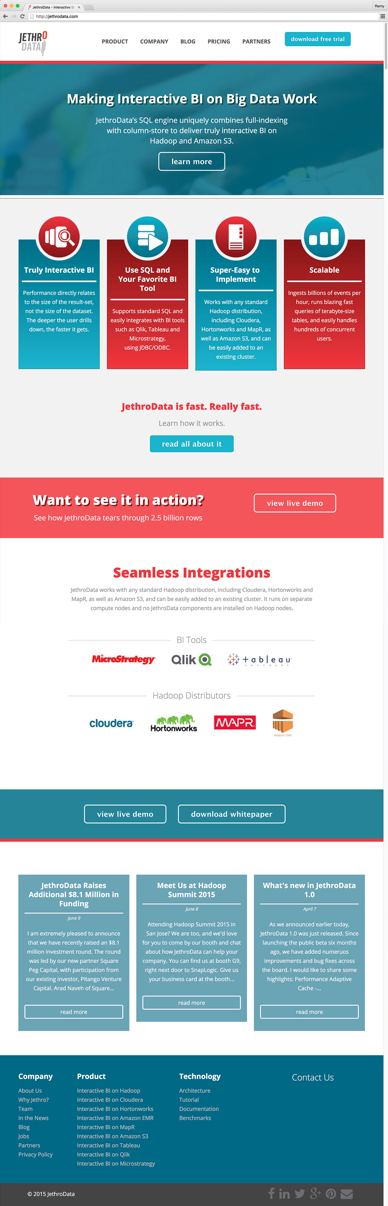
Outdated Website
Solution
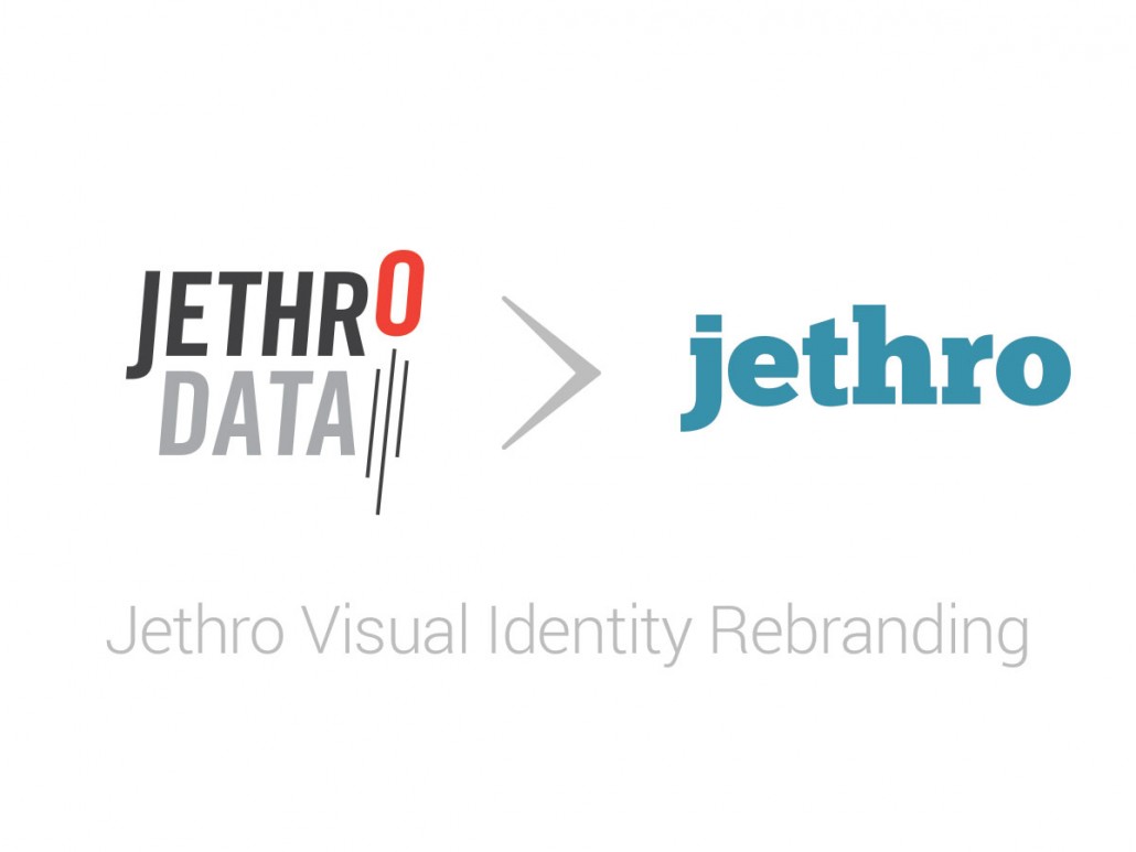
Updated Logo
![]() The old tri-color red black and grey logo with it’s “launching ‘o'” gave way to a contemporary looking solid bold slab-serif logo. The lower-case lettering is more inviting and playful. Jethro’s red gave way to a shade of blue-teal that sets the company apart from other in the space. The teal is more friendly, less alarming and works well with the company’s slightly off-beat name.
The old tri-color red black and grey logo with it’s “launching ‘o'” gave way to a contemporary looking solid bold slab-serif logo. The lower-case lettering is more inviting and playful. Jethro’s red gave way to a shade of blue-teal that sets the company apart from other in the space. The teal is more friendly, less alarming and works well with the company’s slightly off-beat name.
Updated Website Design
The The website was completely revamped from the ground up to give it a contemporary feel. The updated look and feel of the site establish trust as a technology provider selling cutting edge solutions.


Leave a Reply
Want to join the discussion?Feel free to contribute!